Get Weekly Marketing Tips
Join 30,000+ marketers and get the best marketing tips every week in your inbox
A call to action (CTA) is a key element of any marketing or advertising campaign.
The CTA tells your audience what you want them to do — buy a product, sign up for a service, or take another action.
Without a strong call to action, your marketing is likely to fall flat. If you want to create an effective campaign, you need a powerful call to action to get your audience to act.
What is a CTA?
Calls to action come in many forms. They’re on website homepages, product pages, emails, social media, paid ads and more.
The goal of CTAs is to get the person viewing your website or ad to take action that will move them closer to buying.
CTAs are used for more than getting someone to buy. They can also get someone to sign up for your email list or download an eBook from your website. A CTA could get someone to share the content with their friends and colleagues and more.

Why Do You Need CTAs?
We can’t expect website visitors to know what they should do once they arrive on our website or view one of our ads.
There are lots of different places to go on your website. Categories, blogs, contact info, and company history…it can be overwhelming.
CTAs give you the chance to direct visitors to parts of your website that will help them buy. You can tailor your CTAs to different stages of the buyer journey, creating a clear path for visitors.
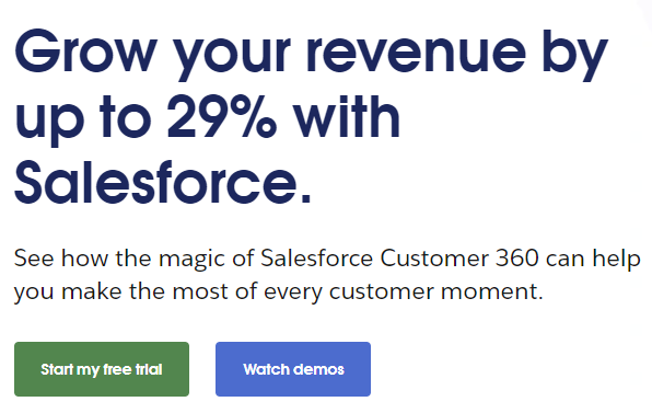
In the example below, Salesforce gives visitors two options. They can start a free trial, and if they’re not ready for that, they can watch demos.
Giving visitors two different paths to follow means that Salesforce can cater to two different stages of the buyer journey. If the visitor is unsure about the first path, they are quickly directed to the second option.
Types of CTAs
CTAs will appear in different areas of your marketing, not only on your homepage.
Different types of marketing that include CTAs are:
- Homepage
- PPC
- Social Media
- Blogging
- Direct Mail
- Adverts
- Posters
- Billboards.
You will have seen ads on TV or radio that ask you to do something — visit a website, visit a store or pick up the phone. Billboards or posters will sometimes ask you to learn more online or in-store.
Is your marketing underperforming?
Request a free website and marketing review and our team will tell you how to improve your marketing.


CTAs are even more common in digital marketing. They appear on website homepages, in blog content, emails and social media captions.
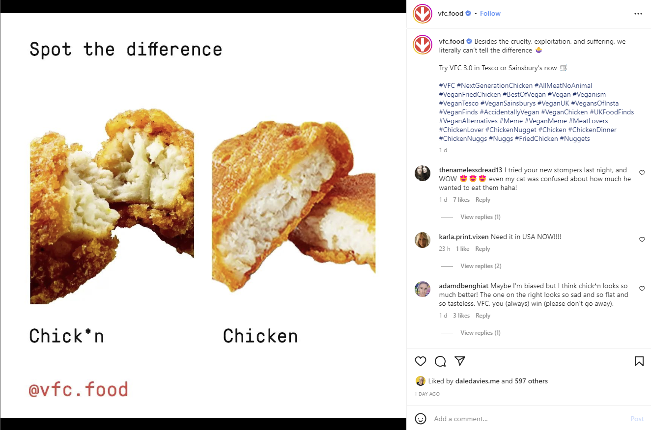
In this Instagram post from VFC, below, there is a line inviting readers to “Try VFC 3.0 in Tesco or Sainsbury’s now.”
How Does Your Target Audience Impact Your CTA?
Most calls to action aren’t one size fits all. Different people respond better to different messages.
If your target audience is young and rebellious, you might want to go for a more tongue-in-cheek CTA, like Dead Happy. This insurance provider uses terms like “Make a Deathwish” and “Life insurance in a jiffy.”
Dead Happy knows its audience gets annoyed with other insurers who make things complicated and have long applications. The CTA below includes “Just looking for quick and easy life insurance?” to reassure these customers that the process will be easy and fast to complete.

Legal and General do things differently.
The company knows its audience worries about the cost of life insurance, so the CTA includes the price and highlights “fixed premiums so you can budget”.
The CTA also includes that the company are the “UK’s number one life insurance provider” to put customer minds at rest. They know they can trust this company.

Dead Happy’s target audience wants life insurance that is quick and easy to sign up for.
Legal and General’s target audience wants life insurance from a trustworthy company that is cost-effective.
This means both businesses’ calls to action are very different, even though they sell the same product.
Depending on the place these CTAs are, they are likely to be worded differently, even if they’re from the same company. This is because of the buyer’s journey.
The Buyer Journey and CTAs
We’ve talked about how CTAs appear in different places – homepages, billboards, TV ads, blogs and more.
That’s where they appear, but what about when they appear?
When/where in the buyer journey will someone see the CTA?
If the person reading your CTA is at the start of their journey and isn’t sure what their problem is (let alone that your product will fix it), then a CTA of “BUY NOW” won’t get their attention.
“Take our quiz to find a fix” might be more appealing.
Let’s look at examples from different parts of the buyer journey, using pet food company Purina as an example.
We started with a Google search for “best dog breeds for first-time owners” which lead to a blog article from Purina titled “10 Best Dogs for First-Time Owners”.
This blog content works well on its own. It includes links to pages about each dog breed with lots of information.
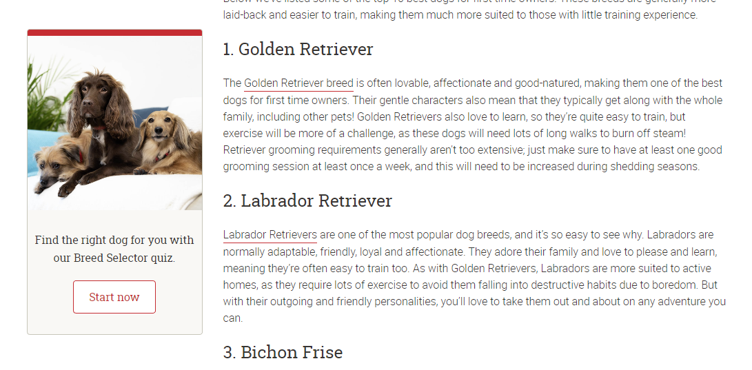
Purina takes the guide to the next level by including a quiz CTA, which you can see below, that will help readers find their perfect dog.
It might seem counter-productive as Purina sells dog food, not dogs. Why aren’t they promoting their dog food?
Let’s take a step back and see where a person searching for “best first-time dog breeds” is in their buyer journey.
The reader is new to the world of dog ownership. They’re not sure what kind of dog they want, let alone the type of food the dog will need.
Is your marketing underperforming?
Request a free website and marketing review and our team will tell you how to improve your marketing.
Purina knows that people new to dog ownership want advice and help. If they get the right advice and help they’ll likely get a dog, and that dog will need food. If they offer advice, then the person taking the advice will see the brand in a positive light.
What follows is a great quiz which is useful and proves Purina’s expertise and knowledge.
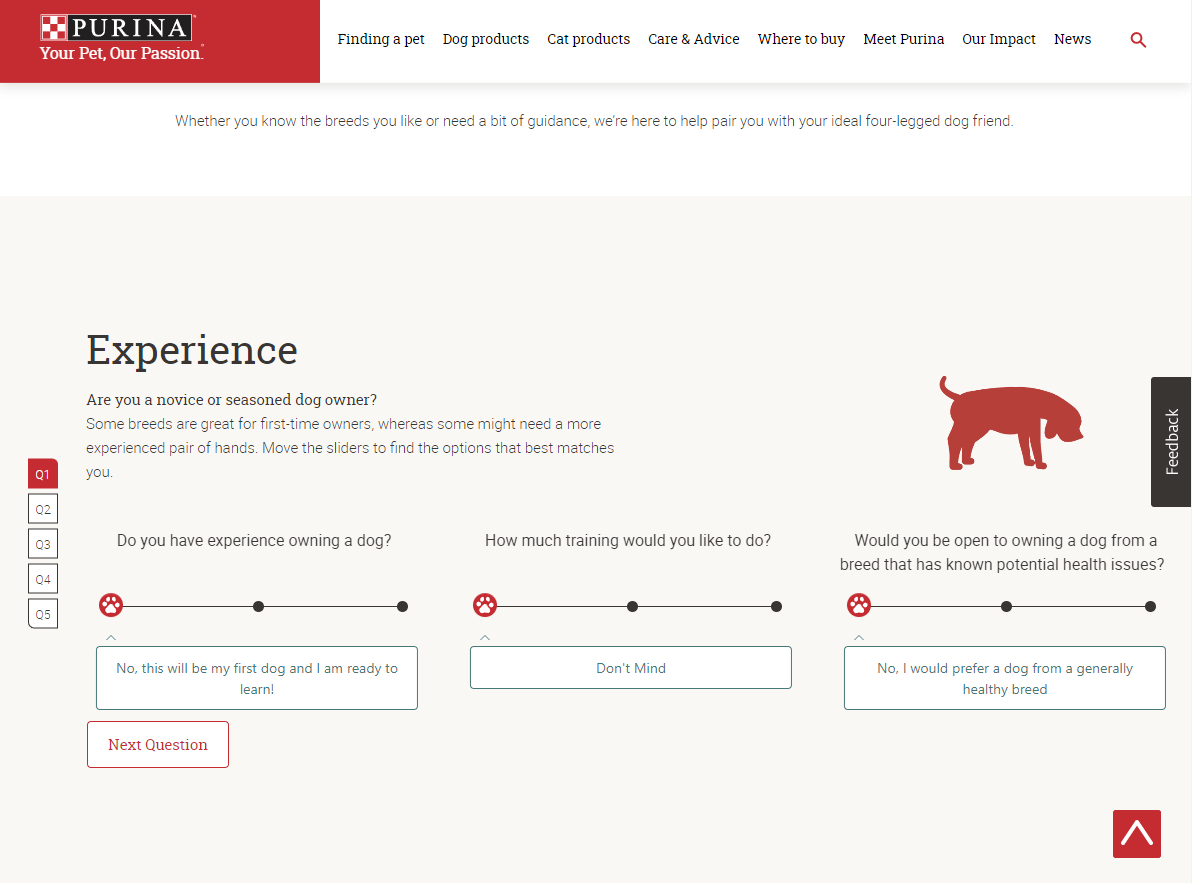
Once you’ve done the quiz, you’re given a list of dog breeds based on your answers.
If you select a dog breed you like the look of, you’re shown a page that describes the dog in great detail, proving Purina’s knowledge.
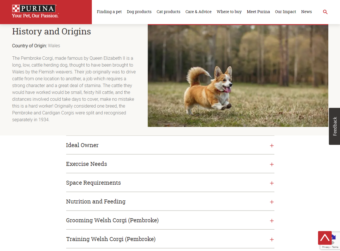
Purina could do even better and add a CTA in the “nutrition and feeding” section. At the time of writing, it doesn’t mention which products would suit this dog breed best, which is a missed chance for Purina to promote its products.
Not everyone on the Purina website is at this early stage, though.
Let’s say an experienced dog owner saw a TV ad for Purina and decided to visit the website to find out more about the food and where they can buy it.
Hovering over the “Dog Products” category on the website menu brings up a drop-down menu of all their product types.
There’s also a handy CTA that will help visitors find local stores that stock Purina.

It surprised us that Purina had such a detailed quiz on how to find your perfect dog breed but no obvious quiz to help you find the best food for your dog.
Most of the categories on the Purina website include over 100 products, which can be overwhelming.
By including a CTA that invites visitors to take a quiz to find the best food for their dog, visitors will be more likely to convert.
They will get a tailored recommendation instead of needing to figure it out for themselves out of 100+ different products.
Purina also caters to different audience types. The brand offers dog food for dogs of different ages and breeds, so let’s take a look at the CTAs they use as part of the content for these audiences.
In a blog titled “Your Puppy’s First Day Home”, Purina includes two CTAs early on. The first, a red button with the text “Suggested Products”, has been included in a bar that follows you down the page as you read.

The first CTA, “Suggested Products”, is a great CTA for someone looking up information about their first day with a puppy stage and fits the content.
The searcher we looked at earlier hasn’t even decided what type of dog they want, let alone the products they need.
Clicking the CTA button on the left takes us further down the page to an interactive CTA that invites the reader to “explore our puppy food”.
This CTA fits the content well again — someone reading about bringing a puppy home will need to feed their new pet.
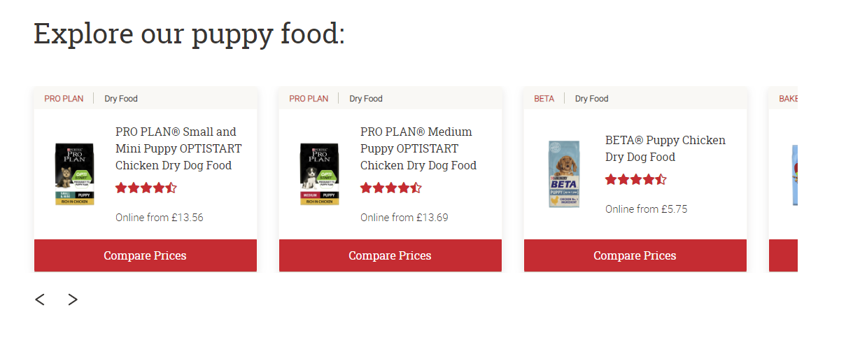
But, the CTA still feels a bit out of place in the blog as the guide doesn’t mention food.
The CTA would fit in better if there was a section about what to feed your puppy on their first day home.
Another CTA on this page that’s related to the content is the newsletter sign-up CTA, which you can see below.
Newsletters are often“one size fits all”. All customers get the same information no matter their interests.
Purina takes a better approach and sends different emails based on customer interests.
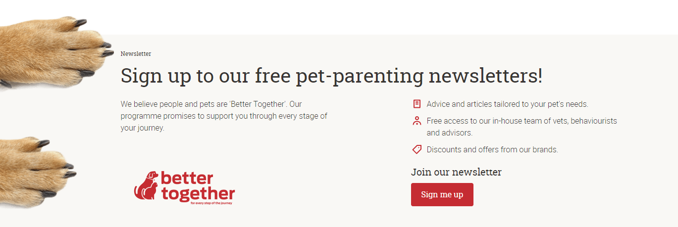
Purina makes it clear in the CTA that the newsletter is for people who are thinking of getting a puppy.
It means that Purina can focus on sharing puppy info in the newsletter and promote food for puppies.
In another blog, titled “Training an older dog”, the email CTA promotes another newsletter that includes all ages of dogs.
It’s a better choice than the puppy mailing list, as visitors looking to learn how to train an older dog are unlikely to be getting a puppy.
Both these CTAs are great as they outline what will be in the emails.
The outline reduces “risk” for the person signing up. They know they will get advice and content for their pet’s needs, free access to advice, discounts and offers.
It takes away the concern that the emails will be a barrage of adverts for Purina’s products. No one wants spam.
Reducing risk is one element that goes into writing a great call to action. Other things include:
- Emotive language
- A clear and concise offer
- Emphasising what’s great about your offer.
How to Write an Effective CTA
Writing good CTAs takes a lot of thought and research. With so many competitors out there, you need to make it clear that you offer the best product or service and “buy now” as a CTA just doesn’t cut it.
Emphasise value and benefits
Not only do you need to shout about the value and benefits of your product — but you also need to outline the value and benefit of this specific CTA.

The above CTA from Netflix is very clear. It offers “unlimited films, TV programmes and more” and the company adds value by stating that you can “watch anywhere” and “cancel at any time”.
Compare the Netflix CTA with the Disney+ CTA below.
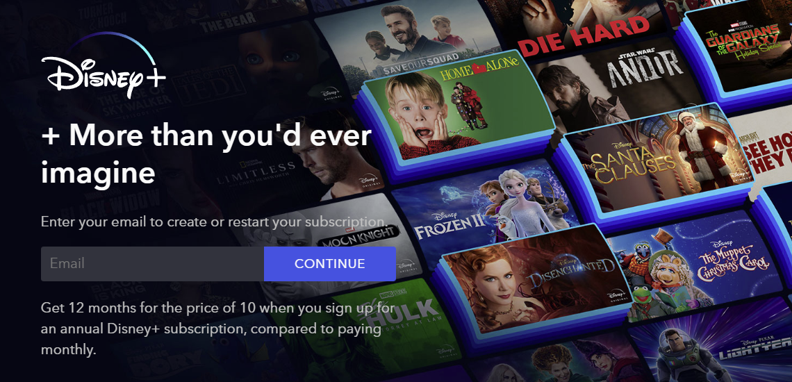
Someone landing on the Disney+ page for the first time might not know what is being offered.
It’s clear in the Netflix CTA that you get films, TV programmes and more. The Disney+ CTA is “+ more than you’d ever imagine”, making it unclear what you get in return for your money.
A few films? Films, TV shows, games, discounts at Disney theme parks? The original actors come and perform the movie in your front room!? Who knows?
Disney owns many film and TV studios, so they have access to popular content that other streaming services don’t. You’d expect that exclusive content to be highlighted here, but it’s not.
Someone comparing these two streaming services based on these CTAs might think Disney+ offers limited content, doesn’t allow you to watch on different devices, or cancel your contract at any time.
So, they go with Netflix, which makes it obvious they offer these things.
Is your marketing underperforming?
Request a free website and marketing review and our team will tell you how to improve your marketing.
Consider the marketing funnel
It’s important to think about where your visitors are at in their buyer journey. As we explored with Purina, different visitors will have different needs and different knowledge of your brand.
Some may be ready to buy as soon as they land on your site, whereas others are still researching their options. Some might not know you are the solution to their problem or offer the product they are looking for.
The marketing funnel your customers follow depends on your business. You can learn more about the marketing funnel in this guide.
Unique CTA related to content
If a visitor has arrived at a blog post on your website focusing on a specific topic, your CTA should match that topic.
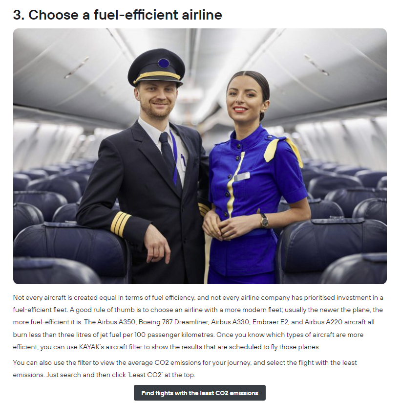
In the below example from Kayak, the brand has created a piece of content about eco-friendly travel. Under the heading “Choose a fuel-efficient airline” there is a call to action asking readers to “find flights with the lowest CO2 emissions”.
Someone reading about eco-friendly travel will want to cut their CO2 emissions while travelling, so the CTA in the article is well placed.
Use emotive language
Emotive language helps you connect with your audience by making them feel a certain way. The below CTA from Paperchase suggests that a purchase from Paperchase will “make their wish come true”, and includes the words “your favourites”.
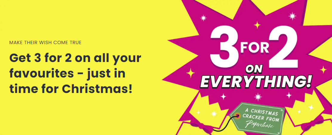
It might not seem like a big deal, but these words spark emotion in the reader.
I do want to make my friends and family’s wishes come true, and you’re telling me you’re doing 3 for 2 on my favourites? Oh, go on then.
Referring to the reader (using words like “you”) elicits the same feeling someone gets when they hear their name being called. It makes the experience feel personal and encourages the viewer to engage with the CTA.
Create a sense of urgency
Ever bought something because it was a limited edition and you didn’t want to miss out? Maybe you’ve pre-ordered something just in case it ended up being super popular on launch. Both of these situations involve a sense of urgency.
Creating a sense of urgency can make customers take action, rather than waiting a few days and forgetting your brand exists.
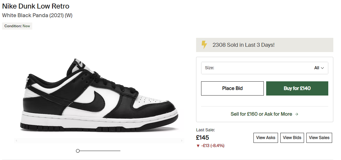
A product page from StockX, which you can see below, uses two different tactics to create a sense of urgency. The first tactic is listing how many products have been sold in the last few days.
This sense of urgency appeals to both of StockX’s customer types — people looking to buy products and people looking to sell products. Those looking to buy will want to act now to avoid missing out and to stay on trend. Those looking to sell will be encouraged to list their products on the site while the item is popular.
The second tactic used on the product page is the “Last Sale”, which includes the price of the last sale and whether or not this listing is a higher or lower price than usual.
Again, it appeals to both customer types. Some people will jump to buy when the cost of the current listing is less than the last sale. Those who want to sell will list when they see the price increase. Listing is less than the last sale, and those who want to sell will list when they see the price increase.
These elements are close to the CTAs of “Place Bid”, “By for £140” and “Sell for…”, so that potential customers don’t miss them.
Other ways to create urgency in your CTA include adding a countdown timer or promoting a limited-time offer.
The below CTA to “Shop now” on the Gym+Coffee website includes a countdown timer and emotive language (“avoid disappointment”) to encourage the visitor to make a purchase.

It’s important to remember not to fake urgency.
If you keep offering a discount after it was meant to expire, then customers will catch on to it and shop around, potentially finding a better deal in the process.
Involve the visitor
When someone visits your website for the first time, they may be a bit overwhelmed. Where do they start? What’s the difference between these products and services? Which is right for me?
Including a CTA that’s targeted towards new visitors can help answer their questions while making them feel more connected to the brand.
Skincare brand The Ordinary helps visitors by giving them the option to fill in a quiz to help them find the best skincare products for them. The below CTA even includes the words “Not sure where to start?”, so it’s clear to these customers that this is the button they should press.
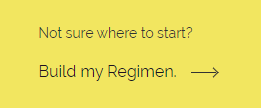
The quiz goes the extra mile, too — it builds an entire regimen that feels very tailored to the customer.
If they came to the site to find one product, got confused and then filled out the quiz, they will be more likely to buy more products at the end of the quiz — especially because these products are the best for them.
SaaS company Monday takes a similar approach on a smaller scale.
When you land on the Monday homepage, which you can see below, you see different checkboxes so you can select the work you want to manage with their software.
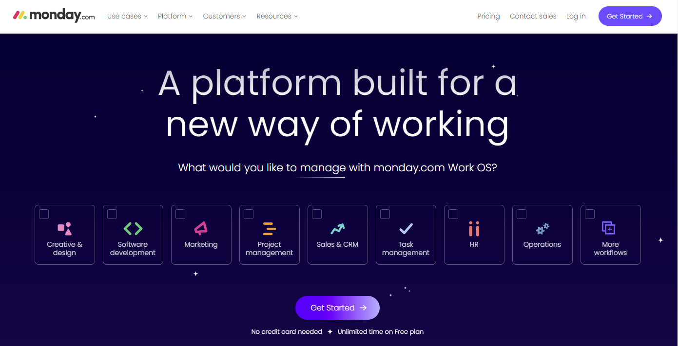
It makes the visitor feel like whatever happens when they click “get started” will be tailored to them specifically.
Reduce risk
It might sound silly to discuss reducing risk around filling in a form or clicking a button that says “get started”. But, you’d be surprised how many “risks” can pop into a visitor’s mind before they click with a CTA.
- “If I fill in this form, will they call me right away? I can’t speak till later.”
- “If I get a quote on a loan, will it harm my credit score?”
- “If I buy this product, will it be easy to return?”
- “If I hire this person, will they do a good job?”
In the case of the CTA below on the Airbnb website, potential customers may be worried about a few different things.
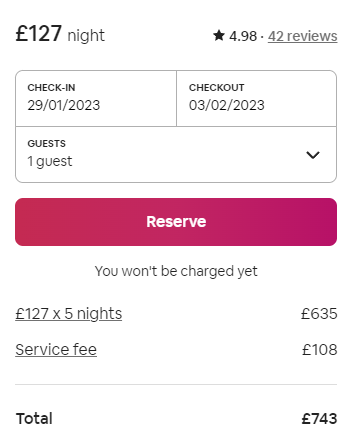
Will they be charged immediately when they hit the reserve button? Maybe they want to pay for their holiday closer to the time or once they reach the property.
What about the Airbnb itself? Is it good quality? Does it look like the photos? Does the neighbour’s dog bark the entire night and keep everyone awake?
Airbnb tackles these fears in a couple of different ways.
They take the stress out of taking the leap to reserve a property by adding a simple line below the CTA button, reading “You won’t be charged yet”. It includes reviews for the property in the same CTA box so potential customers can easily see if the listing is accurate.
Is your marketing underperforming?
Request a free website and marketing review and our team will tell you how to improve your marketing.
Stress simplicity
Not only do customers want a risk-free experience, but they also want an easy experience. They don’t want to fill out a form asking for loads of information, and they don’t want to hunt for the next step they need to take.
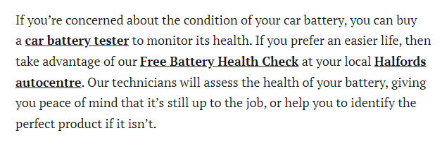
In the blog below from Halfords, the motoring services company, there is a CTA for a car battery tester that takes you to the product page.
This is great for anyone confident enough to test their car’s battery at home. Some people might not want to do it themselves, and if the battery tester CTA was the only CTA, they would click off and find someone who could test their battery for them.
Halfords knows not everyone feels confident doing car checks on their own, so they include another CTA inviting readers to “take advantage of our free battery health check”. Amazing. Someone can do the check for me and for free!
Halfords even handles one last issue by including another link to help readers find their local Halfords auto centre.
If the person reading was unsure if they have a Halfords store near them, they don’t need to go far to find that information.
Short and sweet
Human attention spans are shorter than we’d like to admit. We don’t have time to read paragraphs of information before deciding if a company provides what we need.
Your CTAs need to be as short as possible. Use simple terminology so that your audience can understand what you are offering and the action you want them to take.
The CTA below, on the Specscart website, is simple and understandable. From the CTA, you understand that you can try four pairs of glasses at home for seven days for free. The CTA also includes a picture of the box and what you can expect to receive.

Using only eight words, Specscart has communicated:
- What is included in the trial
- How many frames you can try
- How long you can try them for
- If the trial will cost anything.
How to Write a CTA
You might be looking at your business and wondering how to include all these elements in each of your CTAs.
Truthfully, you don’t need to use all these elements in every CTA. If you are new to writing CTAs, try to include as many of these elements as you can without creating a cluttered CTA.
The above CTA from Specscart emphasises value and benefits (you can try glasses at home for free; you don’t need to visit an optician).
It considers the business’ marketing funnel (most people want to try on glasses before they buy them)
The CTA reduces risk (the trial is free, and you have a whole week to make a decision) and keeps things short and sweet.
It does all that without being busy and overwhelming the visitor. Not all CTAs can be this simple, but it’s proof that it is possible.
What is a Call to Action (CTA)?
A CTA is anything on your website or in your marketing material that invites the person who encounters it to take action.
Calls to action could be a cashier asking a customer if they’d like to go large on their fast food order, adding related links to a blog, an online quiz or a salesperson asking if you’d like to test drive a new car.
The most important thing to remember about your CTAs, no matter what form they come in, is that they should always serve the consumer. Yes, they need to convert these people, but you will have more chance of getting that conversion from your CTAs if they:
- Emphasise the value and benefits of your product or service
- Are made with the customer journey in mind
- Are related to the content they appear in
- Use emotive language
- Create a sense of urgency
- Involve the reader
- Reduce risk
- Stress simplicity
- Are short and sweet.
Use these guidelines to create and test a few different calls to action to see what your audience likes and dislikes. Take the time to research the CTAs your competitors are using.
What to Read Next
- Improve your website’s conversion rate with this guide.
- Learn how to create blogs that get sales.
- Get to grips with tracking your calls to action in Google Analytics 4.