Get Weekly Marketing Tips
Join 30,000+ marketers and get the best marketing tips every week in your inbox
Good B2B web design is about creating a website that looks nice.
Great B2B web design is about creating a website that looks nice and generates quality leads for your business.
Otherwise, it’s like designing a beautiful shop window display but always keeping your door locked.
In some cases, the website design gets so out of hand that it’s like making your customers go through a maze before they can even get to the front door.
But, you don’t want to go so far in the other direction that your website looks unprofessional, which can damage audience trust.
When you get that balance right, the impact can be massive.
In this guide, we’ll explore the foundations every website needs and cover some current B2B website design trends that could help bring your website to the next level.
Not every trend is a good fit for every business, so we’ve explored the pros and cons of each.
The Impact of Great Web Design for B2B Brands
In today’s digital age, web design isn’t just about aesthetics; it’s about functionality and results.
While many of the latest web design trends focus heavily on style, this approach often overlooks a critical aspect for B2B brands: lead generation.
Winning design awards is great, but the true measure of a website’s success lies in its ability to generate leads, drive sales, and enhance the buyer journey.
This is why all of Thinkplus’s website designs are built on thorough SEO and conversion rate optimisation (CRO) research.
User Experience (UX) Driven B2B Website Design
User experience can be the difference between someone getting confused and leaving your site, or converting right away.
If you’ve gone heavy on a design that looks “cool” but doesn’t help your visitor get the information they need to convert, then you’ll need to make some changes.
Conversion Rate Optimisation (CRO)
The main goal of any B2B website should be to convert visitors into leads and, ultimately, into customers.
We consider a well-designed website to be one that uses conversion rate optimisation (CRO)
This includes relevant calls-to-action (CTAs), intuitive navigation, and clear value propositions that will encourage visitors to take the next step.
This could mean filling out a contact form, subscribing to a newsletter, or requesting a demo.
Without taking CRO into account, even the most visually stunning website will struggle to deliver tangible business results.
Design for the Buyer Journey
A smooth and intuitive buyer journey is key to keeping visitors on your site and guiding them through the sales funnel.
Effective B2B website design considers the entire user experience, ensuring that each interaction is seamless and purposeful — everything is useful to the visitor rather than only being there to look good.
From the moment a potential customer lands on your homepage to the point they make a purchase decision, every click and scroll should be designed to improve their journey and make it easy for them to convert.
The B2B buyer journey is already complex before they even reach your website — you don’t want your website’s design to make it even more complicated.

Highlight Your Offer
Your website, especially your homepage design, should be focused on promoting what you offer.
That might seem obvious, but time and time again, we see brands with websites that are promoting the fancy things their web design agency can do rather than their business.
The above the fold section (that’s anything a user can see before they scroll) should make it obvious what you are selling through the imagery, headings, text and CTAs.
If your website looks good but your offer is unclear, you’ll need to make some changes.
Don’t know how clear your offer is? Check with people outside the business to see if they know what your business sells from the website alone. If they don’t, you need to rethink your design.

Everything on Calendly’s homepage is there to help communicate its offer.
The heading of “easy scheduling ahead” immediately lets you know that Calendly offers a scheduling product that makes things easy.
The copy says “easily book meetings”, reinforcing the ease of use and telling you what the product does (meeting booking).
The imagery on the right-hand side reinforces the offer again, saying, “reduce no-shows and stay on track”. It also shares some examples of how the software can do this through text and email reminders.
They could have used an image of some people having a meeting, but that wouldn’t have done as much to explain what Calendly is offering and the problems it solves.
Is your marketing underperforming?
Request a free website and marketing review and our team will tell you how to improve your marketing.

Easy to Scan
Another element of website UX is having a site that is easy to scan-read.
Attention spans are shorter than ever, and people want to know if the web page they’ve landed on is selling what they need or sharing the information they’re after as fast as possible.
Let’s say they land on a product page.
They expect the product imagery to be on the left, with information about the product, like its name, price, specs and reviews to be on the right.
You can change this formula up to make it more exciting or to stand out from competitors. But, remember people are used to viewing product pages with the left to right format. If your page goes too far from this, they won’t be able to find the information they need easily.
That doesn’t mean you can’t have some fun with your product pages, though.

This product page from Unmind is vibrant and keeps things simple, meaning that even though it doesn’t look like a typical product page, it’s still easy for the viewer to find what they need.
It highlights the benefits and features of the software in a simple way, and gives the viewer the option to click on each point to read more.
The main thing this page is missing is a clear CTA, but other than that, it’s a great example of how you can create beautiful product pages that don’t overwhelm your audience with information, instead focusing on the main benefits of the product.
B2B Website Design Trends in 2024
Now we’ve laid out the foundations of a good website, we can explore the trends.
Just because something is trendy doesn’t mean you need to implement it on your website. Keep in mind that your site needs to be updated every 3-5 years; otherwise, it’ll start looking outdated.
As much as we tell people not to judge books by their covers, they do, and they’ll judge your website if it looks outdated and unloved.
Illustration
Illustration and character design can be used in B2B website design just as much as in B2C.
We use illustrations on the Thinkplus website to communicate that we’re a fun digital marketing agency — but we don’t let the illustrations take centre stage.
Instead, they’re there to complement our great results and knowledge, rather than to undermine what we’re trying to say.

Often, in B2B, especially B2B SaaS, you’re selling something that’s hard to photograph.
Illustrations can help bring your business to life and explain what you offer visually.

Travel booking software Rezdy could have added an image here of its software, but using an illustration helps it show the different types of travel businesses that can benefit from its product in a more engaging and fun way.
Rezdy also uses custom icons across the site to fit the business. Adding a visual that’s related to their product helps to quickly communicate the growth a business might have depending on the package option they go with in a way that’s relatable to them.

If you want to go down the illustration route, remember to keep it related to your brand, and ensure it doesn’t overshadow your offer and what you’re trying to communicate.
You want to get leads and sales, not be an art gallery.
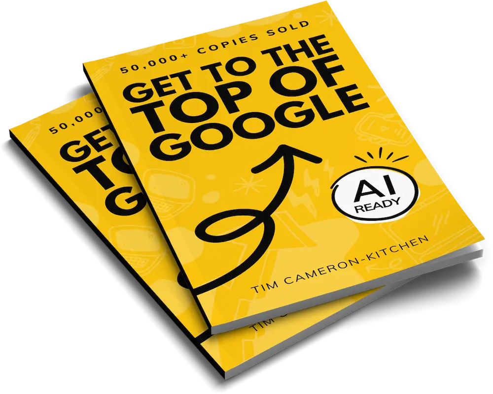
Get to the top of Google
Learn how to get your website to the very top of Google (and turn that traffic into revenue).

Pops of Colour
Another B2B website design trend is clean designs with pops of colour. All the examples we’ve shared so far have used some kind of pop of colour in their designs.
Pops of colour are great for drawing the visitor’s eye to different parts of your website.
In the below image from Hootsuite, the red colour guides the viewer’s eye from the image to the text.
The image includes lots of aspirational elements – a high like count on a social media post and the ideal times to post, which gets the viewer excited, and then the right hand side hits them with the offer.

It’s important here that you go with pops of colour rather than bright colours everywhere. If your site is too bright, it will be difficult for visitors to look at, and it might be challenging for people to read if you’re not using enough contrast.
Deep Scrolling
Deep scrolling is the name given to web pages that reveal more the further you scroll. They morph and evolve, giving you the feeling that you haven’t moved down the page but that your scrolling is changing it.
However, lots of designers aren’t so keen on this from a CRO perspective, as it’s more about revealing things to the viewer slowly than sharing your offer with them.
This style can sometimes work for “About” pages or in blogs where you are telling a story, and you want to build some suspense and immerse the reader in the page.

Bold Text
2024 has been the year of big heading text.
Big text can help you tell a visitor what you do, but it shouldn’t be used on its own above the fold.
This big text needs to communicate what you’re offering. If it doesn’t, then half your above the fold section will be taken up by something that doesn’t benefit your business.

This heading from Craft is a great example of big, bold text being used well on a website. It tells you exactly what the business does, which is helping you craft the best documents in the world.
While big heading text can be impactful, it’s important to balance it with other design elements, like subheadings, images, or interactive elements. These will provide additional context and guide users towards conversion.
Remember, the effectiveness of big, bold text ultimately depends on how well it aligns with your overall brand strategy and resonates with your target audience.
A/B testing different variations can help you determine the best heading for your specific website and business goals, eliminating the guesswork.
Struggling to get all your marketing done?
Download our marketing priority planner and get your marketing back on track.

Dark Mode Vs. Light Mode
The debate about whether dark or light mode is better rages on in offices everywhere.
Instead of picking sides, some businesses have opted to design their websites with both light and dark colour schemes that the visitor can switch between.
Not only is this great for people who have a preference, but also for those who struggle to read one or the other. It’s a design choice and an accessibility feature.
It isn’t as simple as just inverting colours, though. Implementing this type of theme switching effectively requires careful consideration of the following things:
- Consistent Design: Ensure that both light and dark versions maintain your brand identity and provide equally good user experiences.
- Colour Contrast: Pay attention to colour contrast ratios in both modes to ensure readability and meet accessibility standards.
- Easy Toggling: Place the theme switch in an easily accessible location, typically in the header or navigation menu.
- Performance: Optimise the switching mechanism to ensure smooth transitions without affecting page load times.
- User Preference Memory: Consider using cookies or local storage to remember a user’s preference for future visits.
- Testing: Thoroughly test all site elements in both modes to ensure functionality isn’t compromised.

Web Design Trends in 2024
Remember that the key to success in the B2B world isn’t just about following the latest fads.
It’s about finding that sweet spot where eye-catching design meets practical functionality.
Whether you’re making an impact with bold text, playing with light and dark modes, or keeping things clean with pops of colour, always keep your audience and their journey in mind.
After all, a website that looks great and generates leads is the ultimate win-win.
And who knows – you might just create the next big trend yourself.
What to Watch Next
What to Listen to Next
- THIS Part of Your Funnel (Probably) Sucks
- How To Get Qualified B2B Leads using PPC
- How We 10x’d Leads for a Finance Company.